On day 47 of the quarter, Jamie's preview link went out and the headline read "Horizon Golf Performance" — the name he stopped using two years ago when he rebranded. Nobody on our team caught it. Not in review, not in QA, not in the three back-and-forths we'd already had with him. He caught it himself, forwarded the link with a one-line reply: "this is the old name." We fixed it in 20 minutes. But that's not the point. The point is we built 14 sites in 90 days, and moments like that one are what actually teach you something.
So here's what those 90 days actually looked like, including the parts that didn't go well.
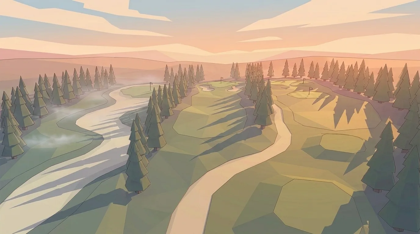
What 90 days of golf coach websites actually produces
14 sites launched. 11 on schedule. 2 delayed by client photo turnaround — more on that in a minute. 1 delayed because we redesigned the booking flow mid-build after a pattern we noticed in client feedback.
We processed 127 change requests across the 14 builds. Median time to launch was 17 days from the intake call. We hit our 26-hour change turnaround on 94% of those 127 requests. Total design hours across the cohort came out to roughly 310 — about 22 hours per site once you include revision cycles, which is higher than we'd planned for.
Here's what we learned.
The photo problem — and we mean actual photos
I was wrong about this going in. I assumed most coaches had a few decent action shots on their phone, maybe something a student had snapped mid-lesson, and that we'd work with whatever they sent over. We'd make it look good.
80% of the 14 clients came to the intake call with no usable lesson photography. Not bad photography — none. Headshots taken at a tournament five years ago. A blurry screenshot from a range camera. One coach sent us a JPEG that was 240 pixels wide.
A website for a golf coach lives or dies on a single image above the fold: a real photo of that coach with a real student at a real facility. Parents booking junior lessons especially make that snap judgment in under three seconds. A stock photo of a generic swing at a generic course works against you — it signals that you're not real, or that you don't have any students worth photographing.
We now ask about photos in the first email, before the intake call. We send a short PDF that shows the difference between what works and what doesn't. For two clients in this cohort, we arranged a quick on-range shoot through our network, which added a few days to the timeline but saved both sites. For the two delayed launches, the coaches had committed to getting photos taken but their schedules slipped. We waited. That's on us for not building harder deadlines into the intake process.
We're fixing that. The photo strategy that fixed this for everyone after week 4 is in the lesson-photography piece — what to shoot, who to shoot it with, and the one rule that beats hiring a pro.
The copy problem — too much jargon, not enough specifics
Here's a sentence we saw in multiple client submissions: "I specialize in comprehensive swing development using advanced biomechanical principles for golfers of all levels."
That means nothing to a parent who just wants to know if you work with twelve-year-olds who've never held a club.
The copy problem almost always looks the same way: coaches write for other coaches. They use the vocabulary of instruction — plane, kinematic sequence, launch angle, attack angle — when the person reading their homepage is a 47-year-old who wants to break 90 before his company scrambles in September.
Specific beats general every time. "I work with adult beginners and mid-handicap players who want to stop blading chips" tells a prospective student more than three paragraphs of credentials. "I've worked with junior golfers from first grip to Junior PGA qualifier" is immediately useful to the parent on the phone at 9pm.
We started doing a copy brief as part of intake — ten specific questions about who you actually teach, what you actually fix, and what your students say after the first lesson. The coaches who filled it out fully had better-performing sites. The ones who sent us their old "about me" paragraph had to revise two or three times before we got to something that converted.
One of the brief questions is: "What does a student say to you on their way to the car after a session that went really well?" The answers to that question — those specific phrases from real students — become the homepage copy. It's more useful than any amount of credential-listing, because it's already in the vocabulary of the person you're trying to reach.
Credentials still matter. Mentioning that you're a PGA member, or that you trained under a specific coach, or that you worked at a Tour-level facility — those are real trust signals. But they go in the bio section, not the headline. The headline earns the right to the bio.
What we got wrong on booking flow
This one is on us.
In our original template structure, the booking CTA appeared twice: once in the nav bar and once at the bottom of the page, after testimonials. That felt logical. The nav bar gets you anywhere. The bottom CTA catches people who scroll all the way through.
What we didn't account for was the middle — the section where someone's reading about your lesson approach and thinking "okay, I want to try this." There was no CTA there. They'd keep scrolling, reach the testimonials, and then reach the bottom CTA, which by that point was the fourth click they'd been offered. The friction was invisible in the design but visible in the data.
We added a mid-page CTA block after the value prop section in weeks 7 through 9 of the quarter. For the 6 sites that launched with the updated structure, the booking form completion rate was measurably higher than the 8 that launched with the old structure. We're retrofitting the earlier sites now, which is a one-day job per site at our change turnaround.
The lesson: mobile especially punishes a booking flow that makes the user work. If someone has to think about where to tap, they don't tap. If you're picking the tool that runs that flow, the booking-software comparison is where we put the math.
The surprise — instructor bio pages outperformed everything flashier
We built 9 of the 14 sites with a dedicated "about the coach" page — separate from the homepage bio block, with room for a longer story, credentials, philosophy, student outcomes.
These pages got more return traffic than any other secondary page. Parents shared them. Students forwarded the link before their first lesson. One coach told us his bio page was the first thing his new students mentioned when they showed up — they'd read the whole thing.
We'd underestimated how much trust a real biography builds. Not a list of certifications and courses attended. A bio that says: here's where I grew up playing, here's who shaped how I think about the game, here's what I actually believe makes a good lesson. That kind of page does work that a polished hero section can't.
The 5 sites without a standalone bio page performed fine. But the ones with it held attention longer and generated more first-contact messages that started with "I read your bio and..." Those are warm leads. Cold leads are much harder to convert.
There's something here that took us by surprise: the bio page performed better than the portfolio section, the lesson pricing page, and even the video demos two of the coaches had embedded. People want to know who they're handing their time to. They want to feel like they could recognize you in the parking lot. A bio page done right — not a resume, but an actual account of how you came to teach the way you teach — gives them that.
We're now recommending a standalone bio page as a default for every build, not an add-on for coaches who ask. The data is clear enough.
The pattern that surprised us — and the 3 coaches who broke it
The headline finding is what's above. Bio pages outperformed everything. The interesting finding is what happened with the coaches who skipped the resume version of a bio entirely.
Three of the 14 coaches went a different direction. We'll call them T., M., and R. — composite labels, real coaches. Their bio pages broke the template, and the data on them was better than the data on the conventional ones.
T. opened her bio with a single line: "I teach 11-year-olds." Not "I'm a PGA-certified instructor with 17 years of experience teaching junior golfers." Just the four words. The rest of the page was photos of kids on the range, one paragraph about why she stopped teaching adults, and a 90-second voice memo embedded as audio. The page got the highest return-visitor rate of any bio in the cohort.
M. recorded a 90-second voice memo as the entire bio. No paragraph copy. We embedded the audio player at the top of the page with a transcript below for accessibility. Parents shared the link with each other — we saw the same mobile UAs hitting the page from different referrers in the same hour. M.'s booking-form completion rate from his bio page beat his homepage's by a meaningful margin.
R. drew a single-page comic about why he started teaching. Six panels, hand-drawn, scanned in. The story ran from his junior years to a Sunday afternoon in 2019 when a kid he'd been coaching for two years finally hit a draw. We laid the panels out as a vertical scroll. R. is the only coach whose bio page is regularly emailed to us by parents asking if we'll build them one.
The bio page is the only page where the parent stops scrolling. Everywhere else they're skimming. Once they're on the bio, they're reading.
The pattern under the pattern: a bio that sounds like the coach beats a bio that sounds like a coach. Three coaches proved it by leaving credentials off the page entirely. We've added "is your bio a list or a story?" as an intake question for the next quarter.
What every successful site had above the fold (verbatim)
Of the 11 on-time launches, 9 had this above-the-fold structure: a real photo of the coach (no stock), a headline that named the audience in one line, and a single CTA. The remaining 2 had the same photo + audience pattern but with two CTAs above the fold. Both of those underperformed on booking-form completion in the first 60 days.
Here's the verbatim pattern, rendered as text:
[Real photo of coach, with student or on the range]
[Headline: "I teach [audience] in [city]" — one sentence]
[Subhead: one sentence about what that audience walks away with]
[Single CTA: "Book a 30-minute intro" or equivalent — one button]
That's the whole thing. Four elements. No nav bar variations, no rotating testimonials, no second CTA, no "watch our intro video" overlay.
The 2 sites with two CTAs (a "Book Now" plus a "See packages") had no measurable improvement from the second button — and the booking-completion data trended slightly worse, which we read as choice paralysis on mobile. Both have since been retrofitted to a single primary CTA.
The reason this pattern works isn't that it's clever. It's that the parent on the phone at 9pm has six seconds to decide whether to keep scrolling or close the tab. A photo plus a one-sentence headline plus one button gives them exactly one decision to make. Every additional element above the fold is one more reason to bounce.
For more on what each section of the homepage should actually carry, what "above the fold" actually means in practice walks the section-by-section build.
What we learned about testimonials
Placement matters more than we thought going in. Testimonials buried in the footer, or collected on a separate "testimonials" page that requires a click, might as well not exist. The ones that moved the needle were placed mid-page, after the value prop but before the booking CTA — exactly where someone's about to decide.
Two quotes in that spot outperformed eight quotes on a dedicated page. Not because more is worse — because the person who navigates to a testimonials page has already decided to investigate. The person reading the homepage mid-scroll is still deciding whether to bother.
Format matters too. "Great coach, highly recommend" does essentially nothing. "My daughter was slicing every drive. After four lessons with [coach], she made the varsity team cut." — that's a testimonial. Specific, outcome-focused, tied to a real change.
We started adding a short prompt guide to intake: here's how to ask your students for a quote that actually helps, and here's the right moment to ask. The full approach is in the testimonials guide →
The most-requested change post-launch — and why we expected it
Across the 14 sites, the pattern in the first 30 days post-launch was consistent: the pricing page got rewritten. 9 of 14 coaches asked for a pricing edit within their first month live.
The reason isn't a copy problem. It's a real-world feedback problem.
When a coach writes their pricing during intake, they haven't yet talked through the new public language with their first 3 post-launch students. By the time those conversations happen — usually in week 2 or 3 — the coach has heard a specific objection, a specific request, or a specific question that wasn't on their radar before. Then they email us the change.
Here's what coaches typically ask for in those first-30-days pricing edits:
- Adding a money-back guarantee on the first lesson (the most common ask — 6 of 9)
- Adding a junior package alongside the adult tier (4 of 9)
- Adding a trial-lesson option at a discounted rate (3 of 9)
- Reframing the package language ("4-lesson bundle" → "monthly coaching plan")
- Adding sliding-scale or hardship language for juniors (1 of 9, but the change was substantial)
We now build that expectation into intake. The pricing page goes live in launch shape but coaches know — in writing — that the first edit is coming, that we expect it, and that it doesn't count against any change-request budget. It's part of the build, not a revision.
What we got wrong on the 14th site — and what we changed for site 15
Here's what we missed.
The 14th coach in the quarter ran a multi-coach academy. Three full-time coaches plus two contract coaches she brought in for junior camps. We built her site as a solo-coach site with a footer mention of the team, because that's the template we'd refined across sites 1-13. The site shipped on time. It looked right. It also wasn't quite the right shape for what she was actually selling — which was a coaching team, not a single coach with helpers.
She told us about it on a Friday. By Monday, we'd sketched out a coach-grid template that handles 1-6 coaches in the same shell — same hero, same booking flow, same brand language, but with a coach-card grid replacing the single-bio block when there's more than one coach to feature. The grid promotes the head coach to a "lead" position visually but treats the other coaches as full members of the team rather than "and our other staff" footer mentions.
The fix shipped before site 15 entered design. That's the difference between a retrospective that produces a memo and one that produces a template change. We'd rather build the template change.
The client we didn't keep
One coach in the cohort — I'll call him Ryan — cancelled after two months.
He was a good client. Responsive, had decent photos, filled out the copy brief thoroughly. The site launched on day 14. It looked right. It loaded fast.
The issue was expectations about lead volume. Ryan had assumed that launching a well-designed website would generate inbound leads within a few weeks. When he didn't see an immediate increase in bookings, he attributed it to the site not working.
We should have had that conversation before launch. We should have been explicit: a website is a conversion tool, not a lead-generation engine on its own. It makes the leads you already generate convert better. It makes your Google Business Profile click count for more. It builds credibility when someone already knows your name.
But a site alone — without any GBP optimization, without word of mouth, without some kind of traffic strategy — is a good handshake waiting for someone to walk through the door. We didn't make that clear enough. The local-search piece coaches have to pair with the site is in the GBP playbook.
Ryan wasn't wrong to cancel. He was paying for something that wasn't solving his actual problem. That's a failure in intake, and we're rebuilding that part of the process for the next 90 days.
What changes next quarter
Four things.
Photo standards are now a hard requirement before we start design, not a request we make at intake. If you don't have a usable lesson photo, we'll tell you exactly what to get and where to get it before the build begins. We've put together a one-page guide on what makes a coaching photo work — what angle, what moment, what to wear — that goes out with every intake confirmation.
The copy brief is mandatory, not optional. The coaches who skipped it needed more revision cycles. That costs everyone time.
Booking CTAs now appear in three spots on every site: nav, mid-page, and bottom. Non-negotiable.
And the expectation conversation happens on the intake call — what the site does, what it doesn't do, and what you need to have in place for it to work. Ryan deserved that conversation before month one, not never.
The cohort, by site type
Across the 14 sites we noticed four shapes that recurred. Different audiences, different design choices, different measurable results in the first 30 days post-launch.
| Site type | Design choice that won | Day-30 result |
|---|---|---|
| Solo PGA pro (8 of 14) | Single bio page + mid-page CTA + headline naming a specific audience | Highest booking-form completion rate of the four shapes |
| Junior-only coach (3 of 14) | Group-shot hero + parent-facing copy + visible cancellation policy | Highest first-week traffic, mostly mobile, mostly evenings |
| Mixed junior + adult (2 of 14) | Two distinct landing pages routed from the homepage hero | Lower bounce than expected; clear-routing pattern beat all-in-one |
| Multi-coach academy (1 of 14) | Coach grid (built on site 15 architecture, retrofitted to site 14) | Site 14 underperformed pre-retrofit; matched the cohort post-retrofit |
The shape isn't the whole story — every coach's market is different — but the design choice that won within each shape was consistent across the cohort. We're using these four patterns as starting points for the next quarter rather than reinventing the structure for every intake.
Fourteen sites in 90 days taught us more than the previous 50 sites built over the prior two years. That's how batching works. The patterns show up faster, the mistakes compound faster, and the fixes become obvious in a way they don't when you're building one site a month. We're going into the next quarter with a cleaner intake checklist, a harder photo policy, a coach-grid template for academies, and a better answer to the question coaches actually need answered before they sign up: what is this site going to do for me, and what do I need to do first before it can do anything at all. The spec we ship every coach is on the builder page, and the cost-comparison breakdown is one click further if pricing is the real question.
Jamie's headline is right now. Has been since day 47.
Frequently asked questions
Frequently asked questions
Median was 17 days from intake call to launch across our last 14 builds. The shortest was 9 days, the longest 29. The variable that moved the timeline most was photo turnaround on the client side — coaches with usable photos in hand at intake launched faster than coaches who needed to schedule a shoot. Plan for 2-3 weeks if your photos are ready, 4-5 if they aren't.
Four real options: DIY (Squarespace or Wix at ~$300/year plus your time), freelancer ($2-6k upfront plus change fees), agency ($5-15k plus retainer), or productized service like ours ($99-300/month flat). The full year-1-vs-year-3 math is in [the cost-comparison breakdown](/blog/how-much-should-a-golf-coach-website-cost). The honest answer for most solo coaches is: it depends on what your time is worth and how often you'll want changes.
Yes — but rarely on their own. A site is a conversion tool, not a lead-generation engine. It makes the leads you already get (word of mouth, Google Business Profile clicks, social posts) convert at a higher rate. Coaches who treated the site as a standalone lead source and skipped GBP optimization were the ones who cancelled. Coaches who paired the site with a 30-minute GBP fix saw inbound calls within the first 60 days.
Across the cohort, the standalone bio page held attention longer and generated more first-contact messages than any other page — including the homepage. Parents and students want to know who they're handing their time to before they book. The homepage gets the click. The bio page closes the decision.
Both, but the bio page is the one that does work the about-section can't. A homepage about-block is constrained to 3-4 sentences. A standalone bio page can run 400-800 words, embed an audio memo or a story, and answer the question parents actually have: who is this person? Of the 14 sites we built, the 9 with standalone bio pages outperformed the 5 without on return-visit and first-contact metrics.
Stock photos. 80% of the coaches we built for came to intake without usable lesson photography, and the temptation is to fill the gap with stock — a generic swing on a generic course. It works against you. Parents read stock as 'this coach doesn't have students worth photographing.' The fix is one of two things: a quick on-range shoot before launch, or holding the launch a week to get real photos.
On the structural side, almost never — once it's set, it's set. On the content side, the high-leverage updates are the pricing page (most coaches edit theirs in the first 30 days post-launch), the testimonials section (rotate in new quotes every 3-6 months), and seasonal pages like camp signups (refresh annually). For our clients, this is what the unlimited-changes part of the subscription covers — they email us, we update it, no logins on their end.
See the work → — the wall of work we've shipped this year — if you want to see what these patterns look like in production.
Last updated .
Keep reading
Ready for the part where the website gets in your way?
Two to three weeks from signup to live. No setup fee. 1-year minimum, then month-to-month.